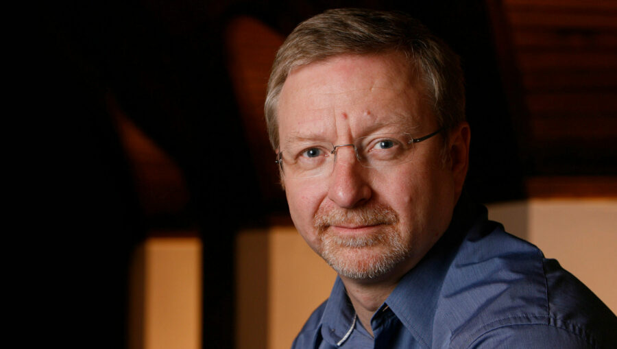
Effects of blue light 3/3: Jonathan Speirs

Speirs + Major, Edinburgh, Great Britain. As readers may be aware Jonathan Speirs retired from Speirs + Major in February 2010 due to ill health. Born in 1958, he sadly passed away on 18th June 2012. This is the only known interview he gave on his attitude towards the use of blue light. An educational charity called the ‘Jonathan Speirs Scholarship Fund’ has been set up in Jonathan’s memory: Jonathan Speirs Scholarship Fund.
Job Posting in Professional Lighting
|
Vasco de Gama Center – Lisbon, Portugal (1999)
The Center was designed by Building Design Partnership in collaboration with Promontorio Arquitectos, headed by Jose Quintela da Fonseca, and is located in the Eastern part of downtown Lisbon, between Oriente Railway Station and the Expo ’98 grounds. The project was opened six months before the Expo ’98 closed and is part of an urban redevelopment programme for the dockland area. A wide four-storey building measuring 35 by 140 metres and housing shops, restaurants and entertainment facilities forms the backbone of the space. The interior lighting was designed by Speirs + Major in Great Britain.

Vincent Laganier: Could you summarise us your lighting philosophy on this Centre?
Jonathan Speirs: The philosophy for that project was based on water and the theme of the Oceans. We want people feel to be more immersed in the experience from the top of the upper level to the lowest level. The roof structure in this space is very strong and dramatic. It’s a beautiful structure and we knew that he wanted to put a little bit light onto the roof. If we didn’t specifically illuminate the roof it would have a dull glow because of reflected light we decided to only put colour on it rather than white light to make the evening experience different to the daytime experience.

Why did you use blue light specifically in this project?
JS: basically, it was to give a sense of harmony to the overall look of the roof. Mainly because if you are aware from colour study, red and blue works in different ways. Red comes forward and blue recedes, in term of your perception of the plane or surface. We wanted the roof to recede to allow the primary focus to be on the people and the shop fronts.
Where did you install the luminaires?
Jonathan Speirs: Along the roof, we used a flood fixture and a spot fixture (rectangular and circular optics). We alternate flood and spot, flood, spot and we achieved a very even distribution. We checked this with a full scale mock-up.

JS: The glazed roof is strongly lit with metal halide 400W lamps. We experimented with different colour filters to achieve colour we are looking for. We tend to pick a blue that has a little bit of red in its makeup. We are obviously aware that blue glass filters are not very efficient but we didn’t want to use blue dichroic to avoid the flat angle colour that shifts through purple to yellow.

JS: We have the blue from the sky that as you progress lower in the project becomes cyan cold cathode neon tube in a specially designed cove detail in the edge of the floor slab. Thus, people goes from the blue sky to a more turquoise cyan colour, as they become more submerged like the Oceans between poles and the equator.
Buchanan street – Glasgow, Great Britain (2000)
There are various reasons why blue light was used in Buchanan Street, the mile-long shopping street in Glasgow. Using blue light, the lighting designers immersed the shoppers on the street in a whole new experience. The amount of light was reduced while still maintaining safety and security. Blue is also representative of the Scottish flag.
What are the challenges of this 1,6km long shopping street?
JS: Originally the project started as a competition with the landscape architect agency call Gillespies. The competition was really about the urban street, the landscaping of the street, but we wanted a strong design concept and image for night-time. One of the problems we perceive in our urban environments is that the inevitable street lighting illuminates everything, the highway and cars, the pedestrians and even the buildings – most by accident. Our urban environments become yellow blancmange ! We were very interesting in the idea that the buildings should read of a strong architectural statement against the pedestrian zone.

What are the reasons of using blue light on a street?
JS: The principle of using blue for the pedestrian zone came from a desire to ensure the buildings stood proud – lit with good quality white light – the people were immersed in a different experience and the choice of colour represented Scotland, from our national flag – the Saltire. There was another important reason and justification for the use of blue. We were very interested in reducing the amount of light used in the street – to still maintain a sense of safety and security but not to be over-lit. At that time we were reading research studies regarding light levels and brightness perception for photopic and scotopic radiation. The material evidenced the fact that at lower light levels – sub 70 lux our eyes perceive a greater brightness in the blue/green end of the spectrum. Illuminance (lux) meters measure a narrow cone of light entering the cell on the meter. This is representative of how our eyes work in normal photopic levels. But in low light levels our eye works differently.
Maybe it’s also because the retina is detecting blue directly into the eyes by one specific cone sensitive on blue?
JS: I think you may be right. We do know that light at the blue end of the spectrum also aids chlorophyll growth in plants. Maybe it is an evolution thing, when we emerged from the sea all those millions of years ago we were more attuned to light that was filtered through water.

Did you manage this lighting level on this pedestrian street?
JS: The highway engineers insisted on an average level of 70 lux with a high uniformity to match the adjacent roads. We felt this was too bright and with the uniformity visually uninteresting and also not suitable for a people area. We argued that measured 70 lux of blue light would be apparently much brighter than measured 70 lux of sodium light. We wanted to reduce the measured level to a point where the lit appearance of the blue and yellow streets were the same. This would have provided lower energy costs. Unfortunately all the research material we provided was ignored and we had to work to the 70 lux criteria and the even uniformity!

Is this the reason why you chose blue halide metal lamps 1000W and not halide metal plus filters?
JS: Yes. We used a narrow beam reflector with a linear spread lens to spread the light along the length of the street. Each pool of light overlapped the next pool and we achieved the uniformity. We were constrained by the centres of the poles and their heights. Interestingly in the second phase, where our designs were extended by the local engineers, the lenses are 90 degrees round the wrong way and the required uniformity is not met. The space looks better as a result.

How did you proposed to manage the short average life time of these lamps (5 000 hours) compare to standard sodium light three time more?
JS: You must remember that originally we wanted to use a much lower wattage lamp to achieve the photopic apparent brightness balance. Therefore there would have been a more balanced situation with Sodium lamps and their longer life. Also the desire of our client in Glasgow was to create a dramatic impact and image for their city. I believe they have achieved this goal.
Extract from the copy of Vincent Laganier, « Effects of blue light », Professional Lighting Design – PLD – magazine, N°40, page 30-35, November 2004, VIA – Verlag für Innovationen in der Architektur, Guetersloh, Germany.
Zoom +
- Jonathan Speirs Scholarship Fund
- Speirs + Major – Lighting design agency
- Professional Lighting Design – PLD – magazine