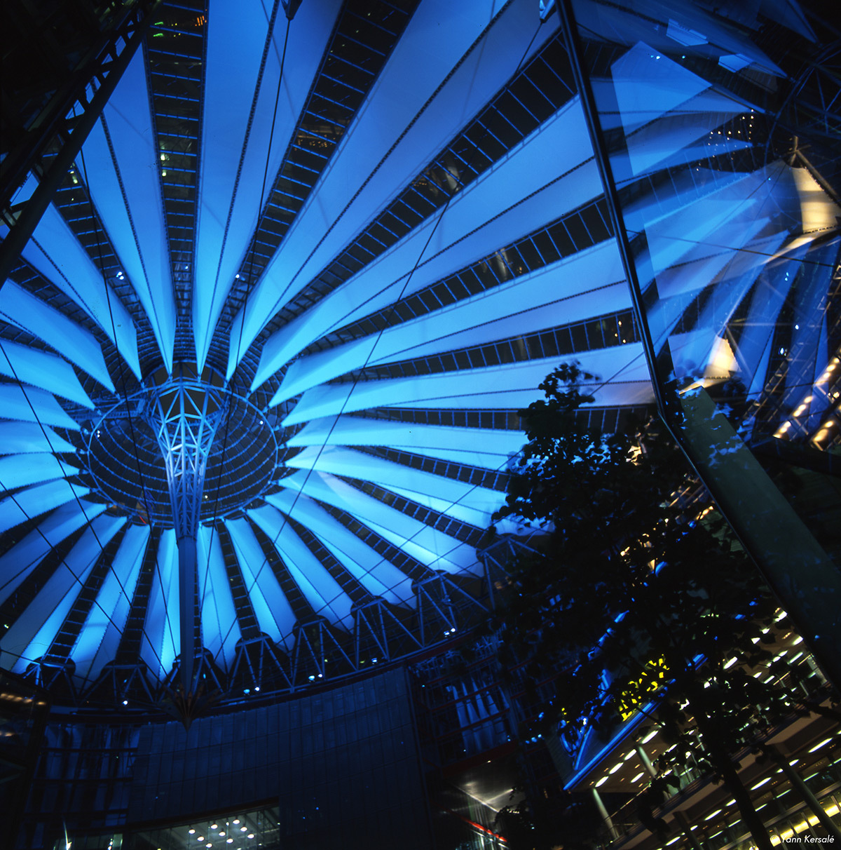
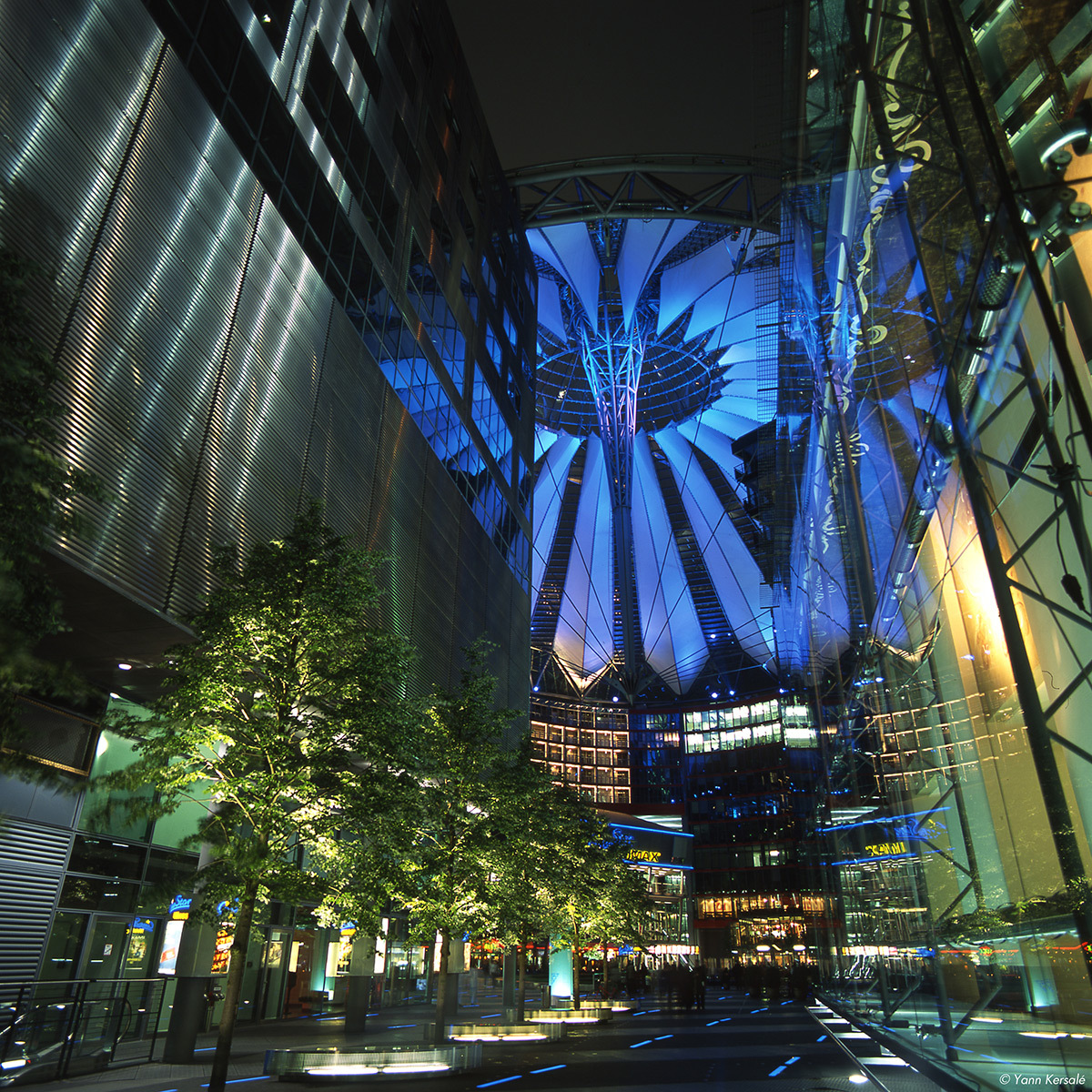
Effects of blue light 1/3: Yann Kersalé

Blue is the colour of faraway, of distance and infinity. Blue is the colour of trust and reliability. Blue is silent, relaxing. It transports us into the realm of dreams. As coloured fight finds its way into architectural fighting. We come across the colour blue more and more often as time goes by. But why is it blue fight in particular that has seen an increase in use, and why do we, as onlookers, feel such a strong attraction to this colour? The artist and designer Yann Kersalé answer to our questions.
Job Posting in Professional Lighting
|
Yann Kersalé, artist and designer
AIK, Vincennes, France

How does blue figure in your work on lighting materials?
Yann Kersalé: I am not wholly dependent on blue for all my creative work as Yves Klein is. Actually, it has always been for reasons of contrast rather than of colour that I have used blue light. I began with photography, and this still plays a significant role in my approach today. When you are dealing with a coloured object in black and white, you need blue if you want to create grey light.
In my projects, the light is either white or non-existent, i.e. shadow. The blue creates a kind of grey. Very often, if I have introduced some blue into the image, it is because there was some white alongside it, giving it an aspect of depth. This was certainly the case with the Grand Palais in Paris, the submarine base in St. Nazaire and the Normandy Bridge.
What was your idea as a light artist for using blue when you were working on those three benchmark projects in France?
YK: Whenever I used blue, it was always for conceptual reasons, or rather perceptual reasons, as Gilles Deleuze would have said. The word « concept » is intended more for philosophers than artists.
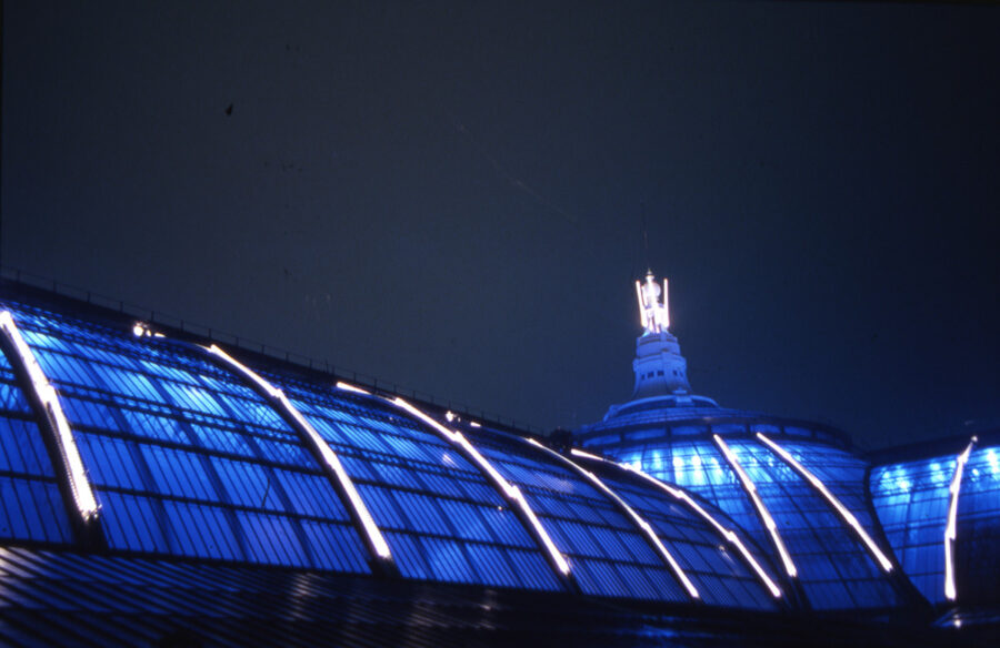
Grand Palais, Paris, France (1987)

YK: The framework of the glass roof gave the impression of being rather disorganised. It had no clear pattern of it. I decided to create an enormous internal hour glass, which was designed to coordinate the random pattern of the glass roof. For twelve hours every day it was filled with lots of tiny polystyrene balls. The lighting along the ribs of the glazed roof was synchronized with the movement of the balls in the hour glass.

YK: The level of blue was dictated by the pulse movements of the atomic dock in the Paris Observatory. With its perpetual, hyper-regulated beep, there was contrast in more than one sense of the word.
Submarine base, Saint-Nazaire, France (1991)
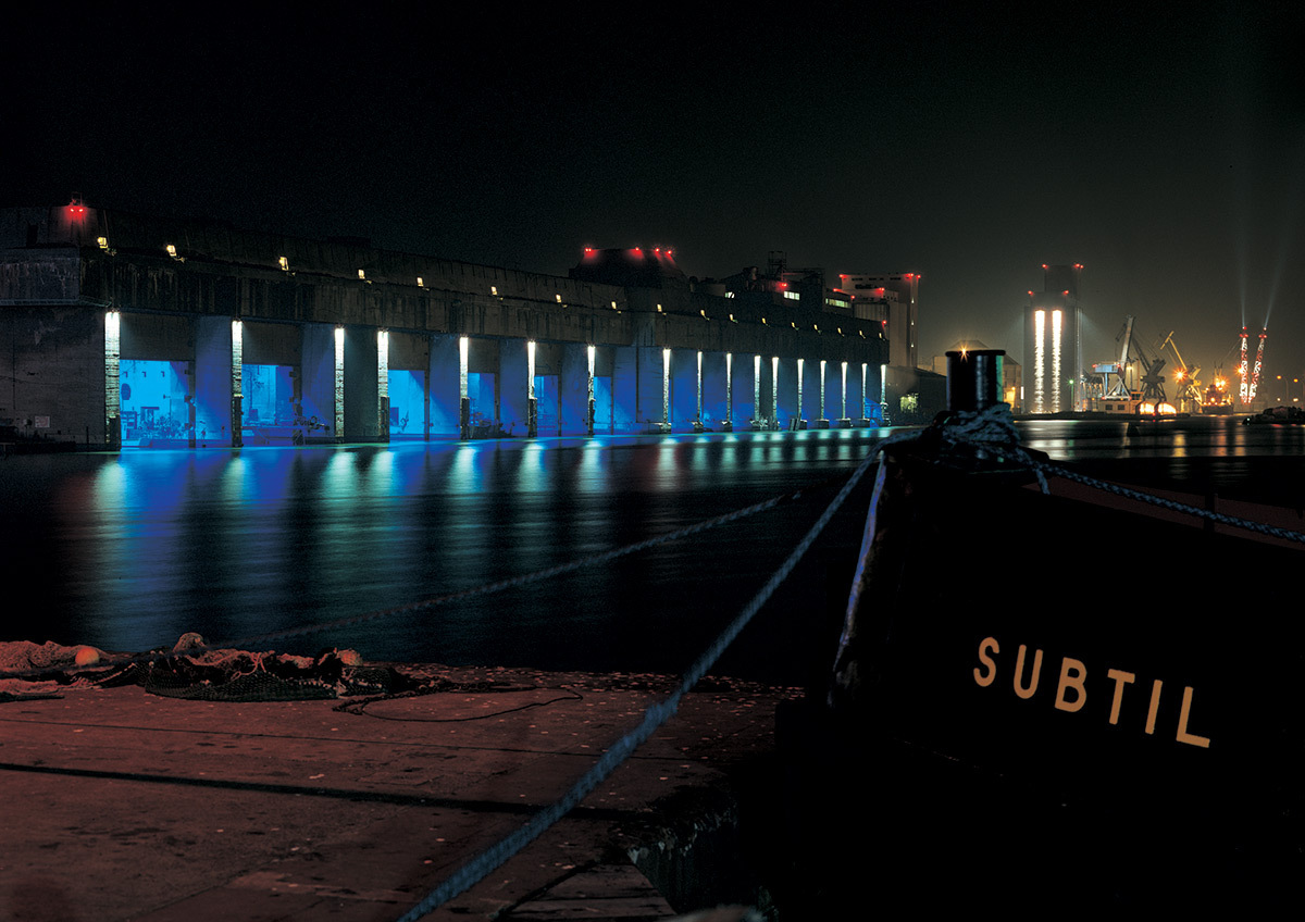
YK: The submarine base is in the heart of the port district of the “Nuit des Docks”. It shows how protrusions and extrusions are linked. I used blue because there were gaps between the partition walls of each section.
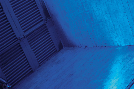

YK: These gaps are marked by white low-angle lighting which seeks out the raw concrete material and highlights the openings. Here the blue serves as a basis, which uses contrast to really bring out the crevices.
YK: The maintenance of the project has been first-c1ass. It was an interesting little venture between the technical services, the mayor Joël Batteux, myself and my entire team. We are all very happy and very proud of the project.
The Normandy Bridge, Honfleur-Le Havre, France (1994)
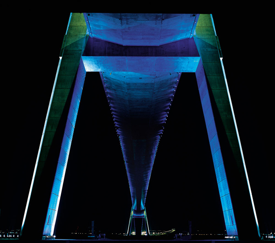
YK: The Normandy Bridge was a joint venture, which I coproduced with an engineer, but the difficulties with maintenance have become very complicated. The project focussed on the underside of the bridge. The inner side of the pylon struts was dynamically lit by blue flashes.
YK: On the other hand, the deck of the bridge was like a standard motorway, using high-pressure sodium lamps. On the lower part of the luminaire lighting the deck of the bridge there is a small blue spot, an association with the lighting below.
Why do you often combine blue and green when lighting trees?
YK: Yes, I use blue, green and turquoise extravagantly when 1 want ta colour foliage. I like to apply layer on layer of colour to create an over-natural look.
St. Martin canal, Paris, France (2003)
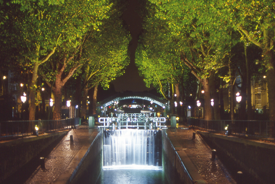
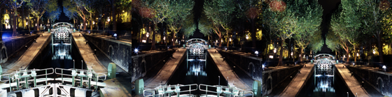
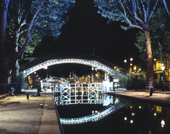
YK: We know very well that the entire range of warm colours, red, orange, amber or yellow, do not go well with foliage or trees with no leaves on them. You only have to look at the branches of a tree near to sodium lighting in the streets to see that it would be disastrous ta purposefully design lighting like that!
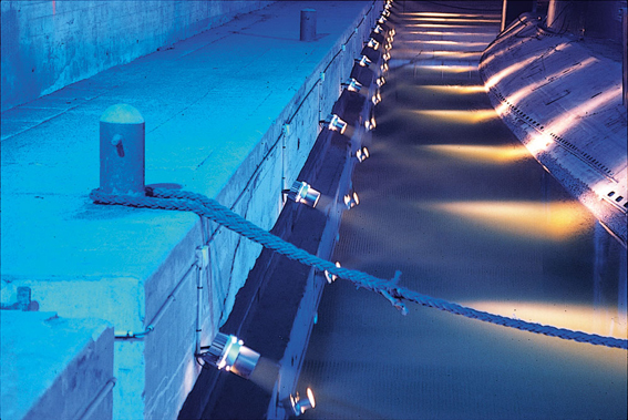
The quays, Cherbourg, France (1994)
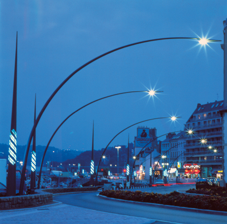
Why did you use these same colours to mark the cylindrical columns of the mobile lighting system on the quays in Cherbourg?
YK: That project is all about the association with the tides. The green represents low tide. The blue is a subterfuge, because 1needed a colour to symbolise high tide. By adding the Iwo together I could create a whole range of shades of blue and green which change, albeit discreetly, in rhythm to the four-hour tide cycle.
Sluice, Thieu, Belgique (1999)

Can you explain the lighting for the sluice in the Canal du Centre?
YK: This was based a little on the same idea. Here it is more about a perpetual cycle. Firstly, the entrance gates are lit up in a pure static white and the external walls ta the sluice in turquoise. When the sluice basin begins to move, the tank full of water turns from turquoise to blue. Similar ta some aquariums, it is related to the way a river runs, symbolising the world, which appears to be blue or green from the outside.
Why does water figure so strongly in the projects in which you have used the colour blue – water being channelled, water being crossed and water nearby? Do you have an affinity for the shore that influences you?
YK: There may be some symbolic clichés involved, but it might be even more than that! I think, quite simply, that the colour blue works very well with the water as a substance. The reflections are more striking, liquid substances refract blue light better than other colours, most notably red.
« 779 – This colour makes astrange and almost incomprehensible impression on the eye. As a colour, it is energy, but it is at the negative end of the spectrum. In its purest pure form, it is the equivalent ofastimulating nothingness. There is something contradictory about the way it looks, somewhere between excitement and relaxation. »
Johann Wolfgang von Goethe, La théorie de couleurs (Zur Farbenlehre), Tübingen, 1810. The Theory of Colour (Zur Farbenlehre), Tübingen, 1810. Extract From the chapter « The physical and psychological effects of colour », Sixth edition, The Colour Treaty (Le Traité des couleurs) Triades, Paris, 1973.
Extract from Vincent Laganier copy, « Effects of blue light », Professional Lighting Design – PLD – magazine, n°40, page 30-35, November 2004, VIA – Verlag für Innovationen in der Architektur, Guetersloh, Allemagne.
Learn more about Yann Kersalé
- 12 inspiring light installations by Yann Kersalé (in French)
- 7 light spaces by Yann Kersalé in Paris (in French)
- Flashback : Coop Himmelb(l)au and Yann Kersalé in Bienne, Switzerlan (in French)