Web Banner Dimensions in Lighting: 8 Stunning Ad Examples

Web banner advertising in lighting isn’t as straightforward as placing an ad in a print magazine. So, let me guide you through all the important factors to consider. In this article, I’ll share insights gathered from my 30 years of experience exploring the Internet. I’m also inspired by the creativity behind successful banners and hope to spark your imagination. Finally, I actively run banner ads on this very site you’re visiting right now.
Please share this summary with your marketing director, communications manager, business owner, public relations agency, graphic designer, or illustrator to master your digital web banner advertising.

What is a Web Banner?
An online advertisement is typically a clickable image, often animated, designed for commercial purposes. Typically, it is positioned as follows:
- At the top of a webpage or article.
- Along the site’s sidebar like on this Website.
- Or at the bottom of the page.
In the world of digital marketing, the web banner remains a crucial visual communication tool. It helps capture attention and engages key decision makers. However, choosing the right format is essential to maximize the impact of your ad campaigns. Effective design and strategic placement can make all the difference, transforming a simple ad into a memorable and successful campaign.
What are the Right Web Banner Dimensions?
Here are eight standout web banner formats in the digital space.
What is the Best Banner Format in Lighting for a Website?
On a website, a larger ad is not always more effective!
Instead, it is the combination of four factors that makes the difference.
- Reading devices: desktop, laptop, tablet, or smartphone.
- Banner formats: from square to vertical or horizontal rectangle.
- Ad message: clear, impactful, expressive, or symbolic.
- Visual design: simple, classic, original, static, or animated.
How does one factor influence the other, and vice versa?
The next sections present case studies.
Let us discover eight proven web banner formats, each with inspiring examples.
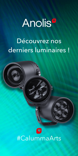
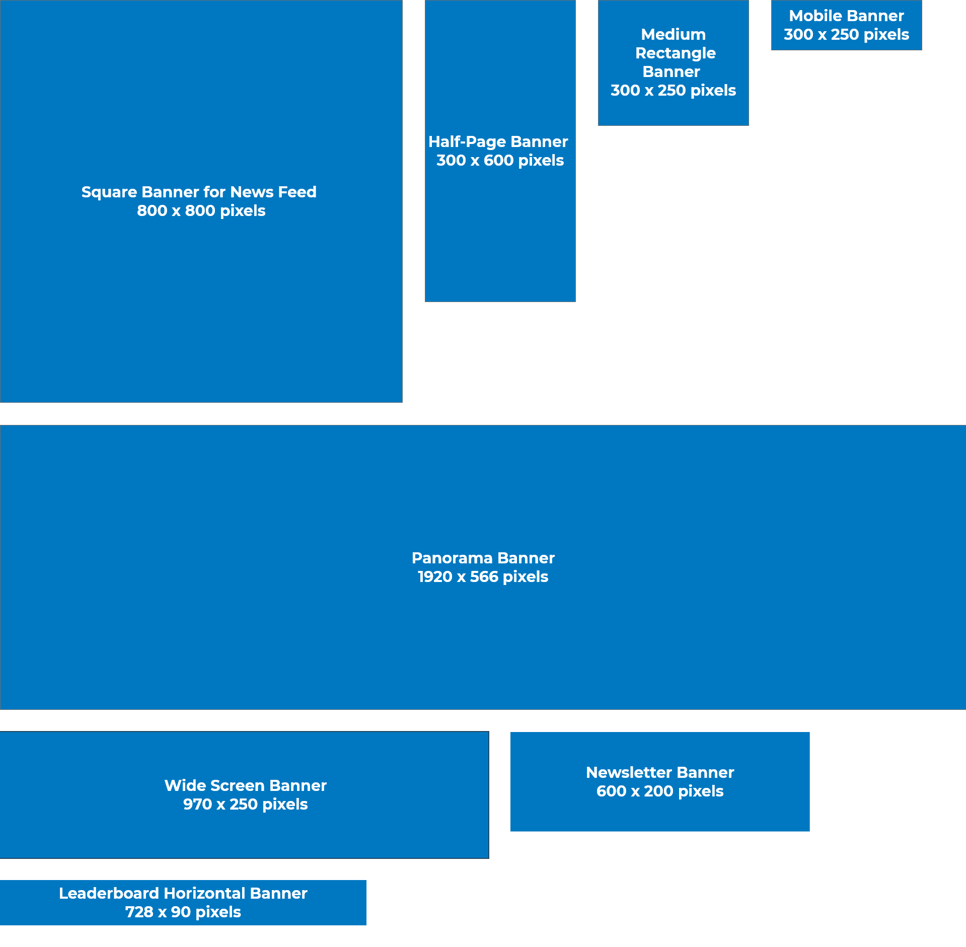
1. Square Banner for News Feed (800 x 800)
A square format works well on platforms that display content uniformly and allow users to scroll, particularly when using smartphones. For example, mobile news feeds on LinkedIn, as well as dashboards like Instagram and Pinterest.
- Key strengths: Optimal visibility, adaptability across different devices.
- Best for: Social media platforms and mobile applications.
- Consider: Centering and balancing the design helps maintain the audience’s focus.
Example: Welcome to the Jungle France
The Welcome to the Jungle France campaign on LinkedIn demonstrates the effectiveness of a square banner. Its clear message and engaging call to action stand out.
Posted for five months, from May to September, it appeared in the news feed of the company’s LinkedIn page.
Takeaway: The contrasting lighting effects and Venetian blinds subtly reference the scorching summer season. Which I quite like!
2. Half-Page Banner (300 x 600)
This vertical format offers significant space for visual and textual storytelling. It is the ideal web banner size for prominent and impactful communication. Large, it immediately catches the eye on a computer screen, and even more so on a smartphone.
- Key strengths: Ample space for content, increased visibility.
- Best for: News sites, blogs.
- Consider: Avoid overcrowding with information to prevent confusion.
Example: ISE, Integrated Systems Europe
The Dutch organizer of the ISE Trade Fair made excellent use of this format on the right-hand column of the Light ZOOM Lumière portal. The goal was to highlight the event. Their advertising campaign drew attention with a clear and attractive presentation.
Used for three months prior to the show, the graphics were effective. The text was concise and clear. The blue color suggested both trust and intelligence.
Takeaway: Three images highlight the event’s applications: A panda emerging from a screen, a control desk, and a projector with its lens. Long live the audiovisual and professional lighting trade show!
3. Medium Rectangle Banner (300 x 250)
This format is a staple online and is frequently incorporated into editorial articles. The medium rectangle banner, commonly called the “Pavé” allows for a high degree of creativity.
- Key strengths: Natural integration, high click-through rate.
- Best for: News sites, thematic portals.
- Consider: The message should be direct, and the design eye-catching.
Example: BT Group
The Italian manufacturer BT Group specializes in modern awnings and bioclimatic pergolas. They successfully used this format in the magazine L’écho de la baie. This rectangle banner blends into the environment while still standing out.
Takeaway: A bright panoramic visual of the sunset sky. The red logo in the top left corner. Three thematic words and a call to action. Protected from the sun. Welcome outdoors!
4. Mobile Banner (300 x 100)
This web banner format is compact and unobtrusive, typically appearing either at the top or bottom of a webpage. It is ideal for promoting a brand or running a long-term ad campaign.
- Key strengths: Subtlety, does not disrupt navigation.
- Best for: Complementing larger formats, campaign reminders.
- Consider: You need a concise message and strong visual impact.
Example: Difusiona
The Spanish distributor Difusiona specializes in high-tech lighting for architectural design. It use the mobile banner format on the website of the Spanish lighting design magazine Lightecture for effective and non-intrusive communication.
Takeaway: Three visuals in a cross-fade sequence.
- The manufacturer’s logo with its slogan.
- A bright view of illuminated linear LED products, featuring the keyword “Lighting.”
- A nighttime view of a doorway highlighted with lighting, with the meaningful word “Architectural.”
5. Panorama Banner (1920 x 566)
This wide-format banner is perfect for making a strong visual impact on computer screens. Also known as a billboard, the panorama banner is a standout because it spans the entire width of the screen.
- Key strengths: Immersive visuals, ample space for creative elements.
- Ideal for: High-traffic websites, streaming platforms.
- Consider: Carefully balance your message, visuals, and call-to-action.
Example: FNCCR Actee
The campaign for the Actee program, organized by FNCCR and Territoire d’énergie, makes a strong impression. Local government officials discovered it in ID Territoriale, the magazine focused on territorial innovation. The campaign delivers a complex message in an elegant and effective way.
Takeaway: A web banner in panorama format shows the effectiveness of ultra-wide advertising. Many users find full-screen advertisements to be disruptive.
6. Wide Screen Banner (970 x 250)
With a width-to-height ratio of 3.9, this banner is the ultimate discreet choice for screens. It adapts seamlessly to smartphones as well. This mega banner fully leverages the width of any desktop, laptop, or stationary computer.
- Key strengths: Optimized for scrolling, high click-through rate on mobile devices.
- Ideal for: Apps, mobile websites.
- Consider: Content must be readable and engaging.
Example: Blue Vision LED
The Blue Vision LED banner features linear lighting fixtures. It appears in the third position after several scrolls on the homepage of the British Arc Magazine.
Takeaway: The double-sided outdoor/indoor design combines aesthetics and functionality. It highlights two product lines within a single banner.
7. Newsletter Banner (600 x 200)
Designed specifically for newsletters, this banner provides ample space for a clear message and attractive design. This integrated format targets an audience already interested in the publication, resulting in precise and effective targeting. It is a balanced choice for many campaigns.
- Key strengths: Optimized visibility, targeted audience.
- Ideal for: Product launches, event announcements.
- Consider: The banner must be engaging enough to stand out.
Example: L&L Luce&Light
The Italian manufacturer L&L Luce&Light showcased this banner format brilliantly in the Light ZOOM Lumière newsletter. The goal was to highlight their lighting expertise. Their approach combines high-resolution images and concise messaging to create a strong visual impact.
Takeaway: Premium aesthetics and precise targeting. Highlights designer products. High-quality visuals reflect the brand’s positioning. Creative layout enhances the format.
8. Leaderboard Horizontal Banner (728 x 90)
The leaderboard format is a staple at the top of web pages. However, its effectiveness is declining, and it is almost invisible on mobile devices. Something to keep in mind!
- Key strengths: Strategic positioning, broad audience reach.
- Ideal for: All types of websites.
- Consider: The banner needs to stand out without being intrusive.
Example: Messe Frankfurt
The German trade show Light+Building organized by Messe Frankfurt made effective use of this format for brand recall on the Lumières 3e magazine website.
Takeaway: Simple animation with colored boxes and text can attract users’ attention online.
How to Create a Web Banner
Are you a CEO, marketing manager, communications director, design lead or graphic designer? If so, you can follow these three key points to create an effective web banner.
1. Creativity and Strategy
Online advertising through web banners is an art that requires both creativity and strategic thinking. To build your brand image, the eight examples listed above illustrate the importance of:
- A clear message.
- Thoughtful design.
- Strategic placement.
These factors help capture and hold the attention of your target audience.
2. Web Banner dimension
Every Web Banner dimension offers unique benefits and may be customised to suit specific goals of a communication campaign. What matters most is choosing the format that best fits:
- Your audience,
- Their digital habits,
- The setting in which your banner appears.
The examples above show the variety and effectiveness of web banners when they are well-designed and well-placed online.
3. The Key to Success
Finally, the key to success is blending aesthetics and functionality. Make sure every banner is:
- Visually appealing.
So you can achieve your marketing goals, such as increasing brand awareness.
From Invisible to Remarkable
Take your banner from invisible to remarkable. Make the leap with LZL Services and capture attention with style!
Spark interest, create desire, and drive clicks.
Take action now!
Explore the Topic Further
- Omnichannel Experience: Light ZOOM Lumière’s Top Strategies
- Latest news from the LZL Services lighting communications agency
Header photo for the article: Man giving a thumbs up, project approval, green light for advertising Web banner © Jaroon, iStock